A Warmer, Lighter Arivu
Arivu now uses a calm, light-only visual system designed around reading, writing, and connected knowledge.
Arivu has a new visual language, but it has not become a different application.
The interface is now light-only, with warm sand around white working surfaces, coral for emphasis, neutral ink, serif editorial headings, and restrained sans-serif controls. Fine dashed rules organize related material. Compact radii and sparse shadows keep the application tactile without turning every section into a card.
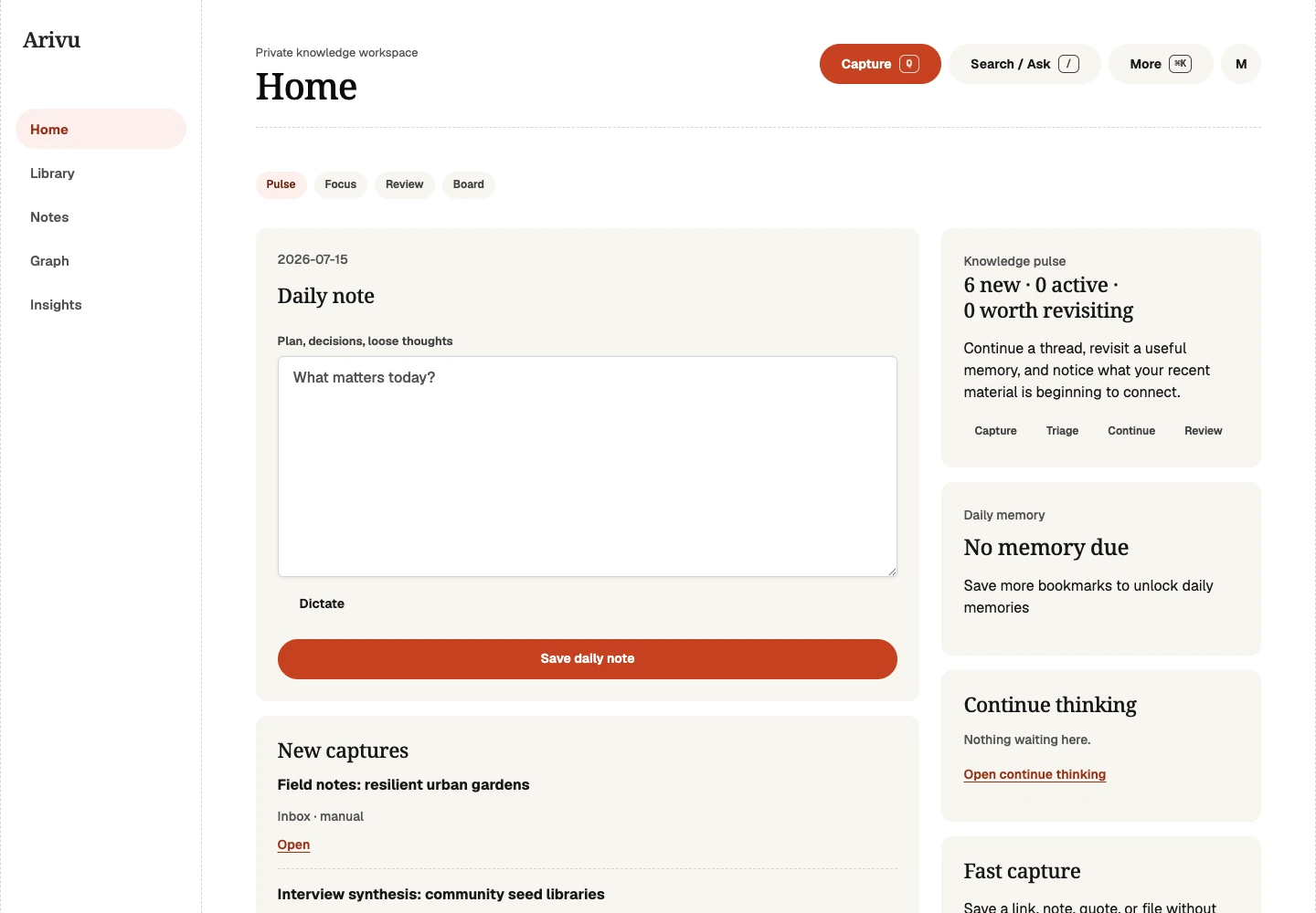
Designed for reading and thinking
Arivu holds long articles, notes, source excerpts, relationship evidence, and explanations. The redesign gives that material room to breathe. Line lengths are controlled, body text has a more generous rhythm, and headings make clear transitions without shouting.
The visual hierarchy also follows the product hierarchy. Home, Library, Notes, Graph, and Insights are the primary destinations. Capture and Search / Ask remain global. Supporting workflows stay available without competing for the first layer of attention.
Light means light
The interface does not switch to a dark palette when your operating system does. This is a deliberate light-only system, not an unfinished theme toggle. Colors, focus states, diagrams, and surfaces are designed and tested for that presentation.
Keyboard focus remains visible. Navigation communicates the current page. Graph information has a list alternative. Motion is limited and respects reduced-motion preferences. Color is never the only way to understand a state or relationship.
What stayed compatible
Routes, menus, data, imports, exports, browser capture, the CLI, and administration still work as before. The redesign changes how the application feels, not what your existing workspace contains or which workflows remain available.
The result is quieter where Arivu should disappear and warmer where it helps you stay with the material. It feels like a place to read and think, because that is the work it exists to support.